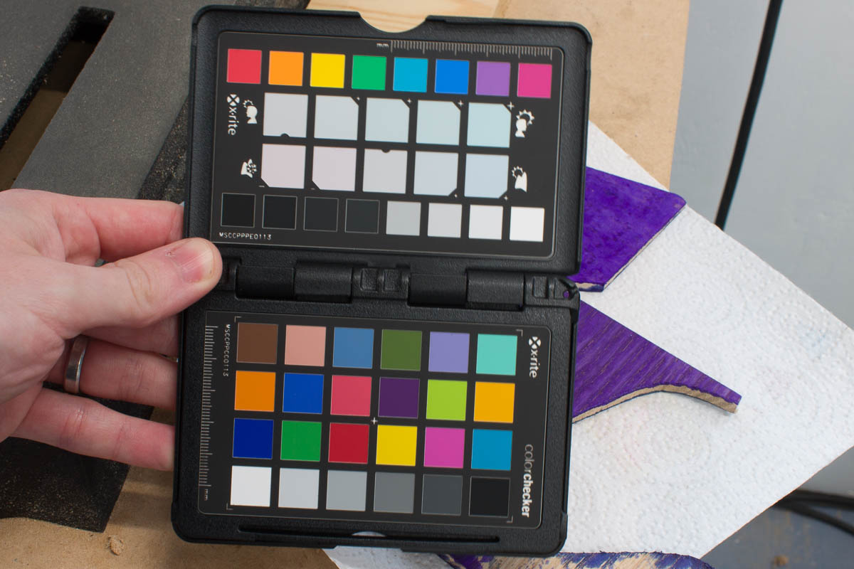
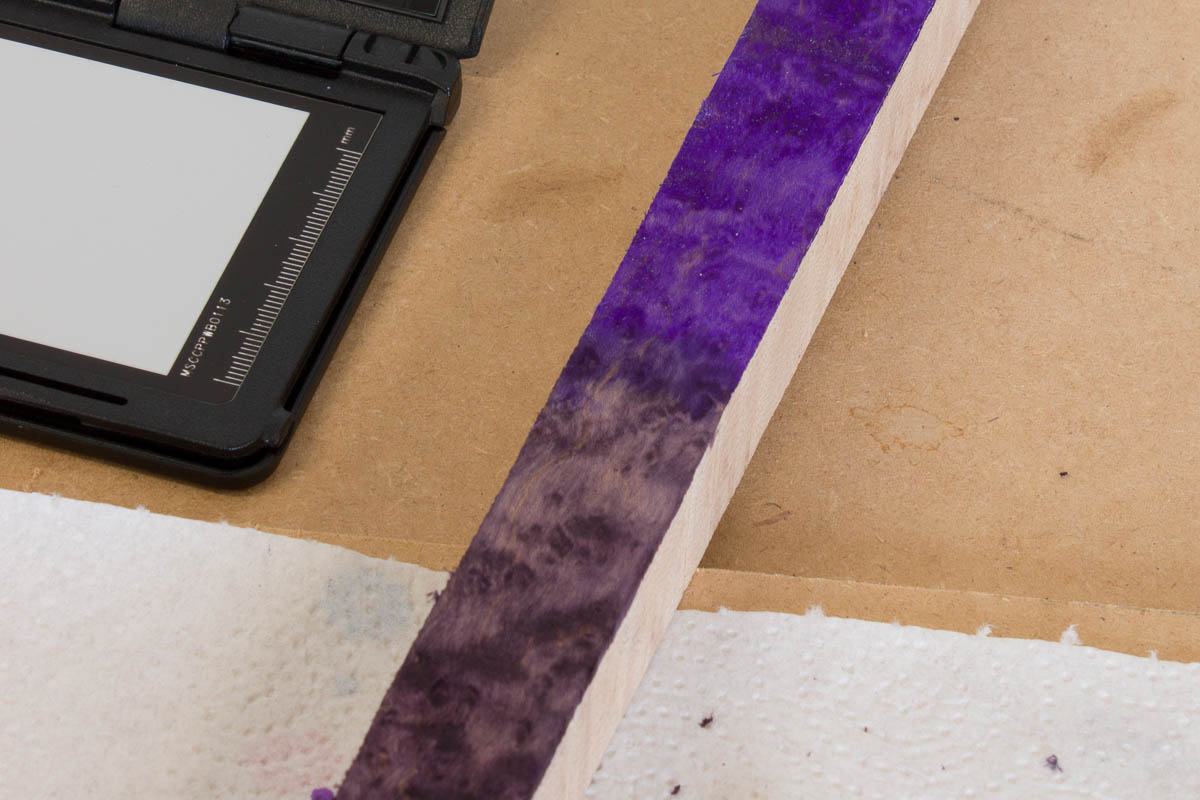
I really struggled with the second build to track the progress of the finishing of the body in photographs. The colour wandered all over the place depending on time of day / lighting. In an attempted to get a more realistic representation of the colours in my photos I’ve started started using the X-Rite ColorChecker Passport Photo. Hopefully this will get calibrated colours and a good white point. I’ll try and use it for all shots when I’m focusing on the finishing, the rest I’ll continue to free form a bit no doubt.
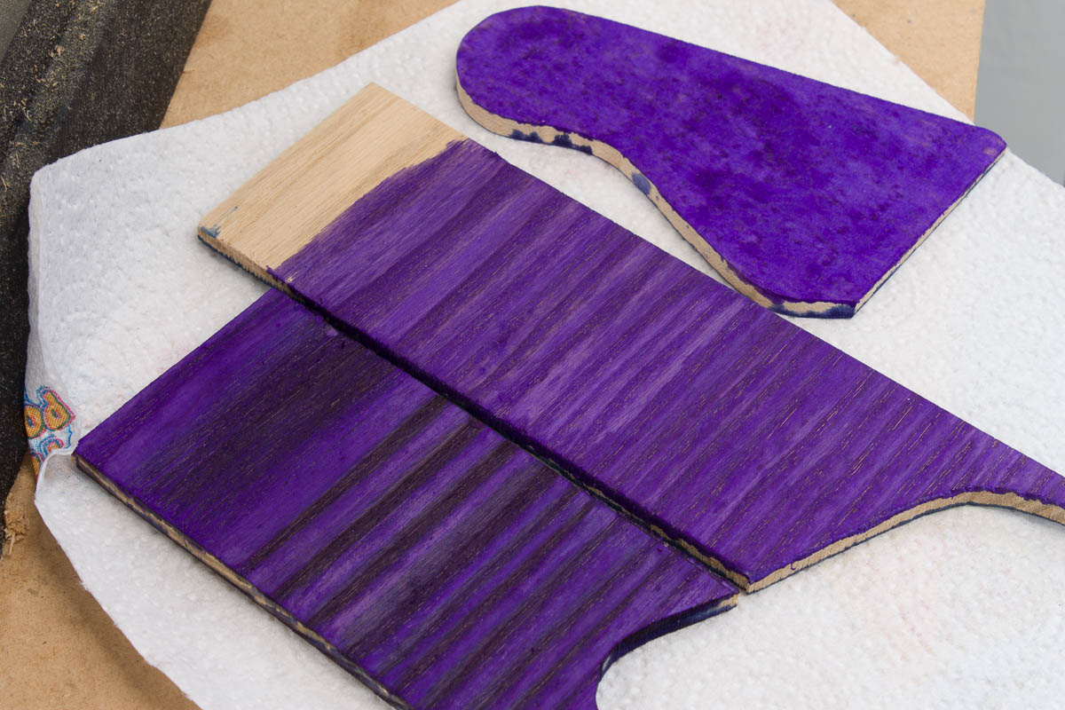
This is a shot of the same alcohol based aniline dye:
- (Middle) On ash, looks pretty flat
- (Bottom) Black premized spirit dye as a first coat, sanded back before the colour coat
- (Top) On birdseye maple, everything looks better on such a nice piece of wood. This bit hasn’t been sanded before hand, which ends up flattening the gain a lot
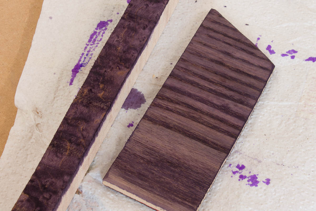
A difficult colour to keep consistent in my photos no doubt. I’m liking it on the maple (left), not sure on the more yellow ash (right). Less consistent coverage than the strong purple it feels.
The two dyes on the same bit of maple for comparison. I think I need to prep some of the body off-cuts into some well sanded sections to do some real tests upon in coming weeks.